
Picture the moment. You sit down, open your platform, and pull up the gold chart. The candles are moving. Your heart picks up a little. You lean in, and somewhere in the back of your mind a quiet voice is already whispering what you want to happen. Up. It has to go up. You’ve decided.
And here is the strange thing about that moment: you are no longer really reading the chart. You are reading your own hope, painted onto the candles. The market has become a mirror.
I’ve watched this happen to more traders than I can count, and if I’m honest, it happened to me for years before I understood what was going on. The chart didn’t change. My state of mind did. And that changed everything I “saw.”
So let’s slow down together. Learning to read a gold chart is a real skill, and I want to teach you the basics of it plainly. But the deeper lesson, the one almost nobody tells beginners, is that the biggest edge isn’t in the lines. It’s in the head you bring to them. A clear head reads the chart. An anxious head lets the chart read you.
What “Reading a Gold Chart” Actually Means
When people say they want to learn to read a gold chart, they usually imagine memorizing patterns, a shape here, an indicator there, and suddenly the future reveals itself. That’s not what reading is.
Reading a chart of gold (XAU/USD) is closer to reading a room. You’re not predicting exactly what every person will do. You’re getting a feel for the mood, the direction things are leaning, and where the tension sits. Price is just the record of a long argument between buyers and sellers, printed as candles over time.
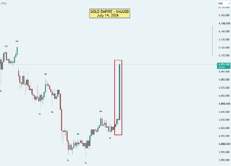
Look at a chart like the one above. Before you draw a single line, before you think about any level, ask one honest question: which way is this leaning? Not “where will it go next”, just “what has it been doing.” That question alone puts you in the right posture. You become an observer, not a gambler waiting for confirmation of a wish.
What a Trend Really Is (Up, Down, and Sideways)
Everything in chart reading starts with the trend, so let’s be clear about what a trend actually is. A trend is simply the general direction price has been travelling over a stretch of time. There are only three:
- An uptrend: price is generally making higher peaks and higher dips as it moves along. The overall drift is upward.
- A downtrend: price is generally making lower peaks and lower dips. The overall drift is downward.
- A sideways (or ranging) market: price is drifting mostly flat, bouncing between a rough ceiling and a rough floor with no clear direction.
That’s it. Most of the confusion beginners feel comes from arguing with the chart instead of naming it. If gold is drifting sideways and you’ve decided it’s about to break upward, you’ll interpret every small bounce as proof, and you’ll be trading a story, not a trend.
Naming the trend out loud, in plain words, is the first discipline. “Right now, on this timeframe, gold looks like it’s leaning up.” Or down. Or nowhere. You don’t need to be a genius to do this. You need to be honest.
Market Structure in Plain Language
Once you can name the trend, the next skill is seeing market structure, and this word scares people far more than it should. Market structure just means the pattern of highs and lows that price leaves behind as it moves.
Think of price walking up a staircase. In a healthy uptrend, each step reaches a higher high than the last, and when it pulls back, it stops at a higher low than the previous dip. Higher highs, higher lows. That rhythm is the structure of an uptrend. Flip it upside down, lower highs and lower lows, walking down the staircase, and you’ve got the structure of a downtrend.
Layered on top of that are two more plain ideas:
- Support is an area where price has repeatedly stopped falling and turned back up, a kind of floor where buyers have shown up before.
- Resistance is the opposite, an area where price has repeatedly stopped rising and turned back down, a kind of ceiling.
These aren’t magic lines and they’re not exact. They’re zones, not precise numbers. When you learn to read a gold chart, you’re really learning to spot these floors, ceilings, and staircases at a glance, and to notice when the rhythm breaks. When an uptrend suddenly makes a lower low, the structure is telling you something has shifted. You don’t have to react. But you should notice.
The chart isn’t hiding the answer from you. It’s showing you a rhythm. Your only job is to see it clearly, not to argue with it.
Moving Averages: A Guide, Not a Command
Beginners often reach for indicators hoping one of them will make the decision for them. I want to gently steer you away from that. Indicators don’t decide. They describe.
A moving average is one of the simplest and most useful. It takes price over a chosen number of periods and averages it into a single smooth line, so the jitter of individual candles quiets down and the underlying direction becomes easier to see. When the line is generally sloping up and price is holding above it, that supports the read that gold is in an uptrend. When it’s sloping down and price sits below it, that supports a downtrend read.
Notice my language: it supports a read. It doesn’t hand you a trade. A moving average is a trend guide, a way to confirm what your eyes are already telling you about direction, and to keep you honest when your emotions want to argue. It is not a green light and it is not a signal to act. No single line, on its own, is a reason to enter the market.
Used this way, moving averages are calming. They take a noisy chart and remind you, plainly, which way the weather is blowing.
Your Timeframe and Your Mood Change What You See
Here’s something that trips up almost everyone. The same gold chart can look bullish and bearish at the same time, depending on the timeframe you’re looking at.
Zoom out to a higher timeframe and you might see a calm, steady uptrend. Zoom into a very short timeframe and that same market looks like chaos, lurching up and down every few minutes. Neither view is lying. They’re just different distances from the same object. A beginner staring only at a fast, low timeframe often feels a constant urge to act, because at that zoom level everything looks urgent.
This is why the timeframe you choose is a decision about your own nerves as much as your strategy. Faster charts demand faster reactions and pull harder on your emotions. Slower charts give you room to think.
And then there’s mood, the quiet factor almost no course mentions. When you’re calm, you see the chart. When you’re anxious, bored, or desperate to make back a loss, you see what you need to see. Fear makes real setups look dangerous. FOMO makes weak setups look like the opportunity of a lifetime. Boredom invents reasons to trade when the honest answer is “there’s nothing here right now.” The candles didn’t change. Your eyes did.
The Clear Head: Stepping Away and Coming Back
This brings me to today’s real lesson, the one our channel keeps circling back to. Sometimes the smartest thing you can do with a gold chart is close it.
It sounds almost like a joke, the trader who steps away. But I mean it seriously. When you notice your heart racing, when you catch yourself arguing with the chart, when you feel that pull to “just get in before it’s gone”, that is not the moment to read structure. That is the moment to stand up, get a glass of water, walk to the window, and let your nervous system settle.
Because here’s the truth I’ve learned the slow way: the market will still be there when you come back. Gold has been traded for a very long time and it will keep printing candles tomorrow. The opportunity you’re afraid of missing is one of thousands you’ll see. But a decision made from a racing heart is expensive, and you often can’t take it back.
When you return with a clear head, something quietly remarkable happens. The same chart looks different, not because it changed, but because you did. You can name the trend without flinching. You can see the structure without needing it to say yes. You can decide that the right move is no move at all, and feel fine about it.
An anxious head lets the chart read you. A clear head reads the chart. The difference isn’t talent, it’s the state you choose to sit down in.
A Calm Chart-Reading Routine
Here’s a simple routine you can run every time you open a gold chart. It’s not about being right more often. It’s about approaching the chart from a settled place, so that whatever you decide, you decide it clearly.
- Name the trend first. Before you touch anything, say it plainly: up, down, or sideways on the timeframe in front of you.
- Mark the structure. Where are the recent higher highs and lows, or lower highs and lows? Where are the obvious support and resistance zones?
- Check your emotional state. Honestly, are you calm, or are you anxious, bored, or trying to win something back? Name it.
- Define your risk before anything else. Decide what you’re willing to lose on any idea before you think about what you might gain. Risk first, always.
- If you’re unsure, step away. Uncertainty plus a racing heart is not a setup. Close the chart, breathe, and come back later. The market waits.
Not every setup wins, and no routine changes that. Consistency doesn’t come from finding a perfect pattern. It comes from following a structured process, in a steady frame of mind, over and over, especially on the days you’d rather not.
Get the free Gold Empire survival sheet, a one-page guide to protecting your account through the kind of market this article describes. One email, no spam, unsubscribe anytime.
Frequently Asked Questions
How do I know the trend of gold? Look at the general direction of the highs and lows over the timeframe you’re studying. If price is broadly making higher highs and higher lows, it’s leaning up; lower highs and lower lows, it’s leaning down; roughly flat between a ceiling and floor, it’s sideways. Say it out loud in plain words before you do anything else.
What is market structure? It’s simply the pattern of peaks and dips that price leaves behind, the staircase of higher highs and higher lows in an uptrend, or lower highs and lower lows in a downtrend, along with the support and resistance zones where price has repeatedly turned. It’s a way of describing the market’s rhythm, not a prediction of its next move.
Which timeframe should a beginner use? There’s no single correct answer, but very fast timeframes tend to pull hardest on your emotions and demand quick reactions, which is a lot to handle when you’re learning. Many beginners find it calmer to start on higher timeframes, where there’s more room to think and less pressure to act. Choose the one your nerves can actually handle.
How do emotions affect chart reading? Enormously. Fear can make a reasonable idea look dangerous; FOMO can make a weak one look irresistible; boredom invents reasons to trade when there’s nothing there. Your emotional state quietly edits what you “see” in the candles. That’s exactly why checking your state, and stepping away when it’s off, is part of reading the chart, not separate from it.
About the Author
I’m Matthew, and I run the Gold Empire community, around 12,900 traders who care more about process than hype. My approach is simple and, I’ll admit, a little unglamorous: structured process, honest reasoning, and discipline over noise. I share real setups with the thinking behind them, so you can see how a decision is made, not just what it is. I don’t promise returns and I never will, because anyone who does is selling you a feeling, not a skill. What I offer is guidance, a steadier way to look at the market, and at yourself while you’re looking.
Risk disclaimer: This article is for educational purposes only and is not financial, investment, or trading advice. Trading gold (XAU/USD) and other financial instruments carries a significant risk of loss and is not suitable for everyone. Nothing here is a recommendation to buy, sell, or hold any instrument. Past market behavior does not predict future results, and any growth or movement mentioned is purely illustrative. Always do your own research and consider seeking advice from a licensed financial professional before making any decision. Never risk money you cannot afford to lose.
If you’d like to learn this way of thinking alongside other traders who value patience over noise, you’re welcome to join us on Gold Empire on Telegram. No pressure, and no rush, the door is simply open whenever a clear head brings you there.
One step first
Where should we send the Gold Survival Sheet?
Leave your email and we will send the free one page checklist, then take you straight to the Telegram channel.
No cost and no obligation. Educational only, not financial advice, and nothing here promises a return. Unsubscribe any time in one click.
Related from Gold Empire
Leave a Reply