
Most people learn the fancy words first. They hear about order blocks, fair value gaps and market structure before they can confidently read a single bar on the screen. Then they wonder why the chart still looks like noise.
A gold chart is built from one small unit, repeated thousands of times. That unit is the candlestick. If you can read one candle properly, you can read a chart. If you cannot, every technique stacked on top of it is guesswork with a professional-sounding name.
This is the foundation piece. No patterns to memorise, no signals to copy. Just what a candle actually is, what it can honestly tell you, and where beginners consistently read too much into it.
What a candlestick actually is
A candlestick is a summary of one slice of time. Nothing more.
You choose the slice. On a 1-hour chart, each candle covers one hour of trading. On a 15-minute chart, each candle covers fifteen minutes. On a daily chart, one candle is a whole day. The candle does not change what happened in the market, it only changes how much of it you are looking at in one glance.
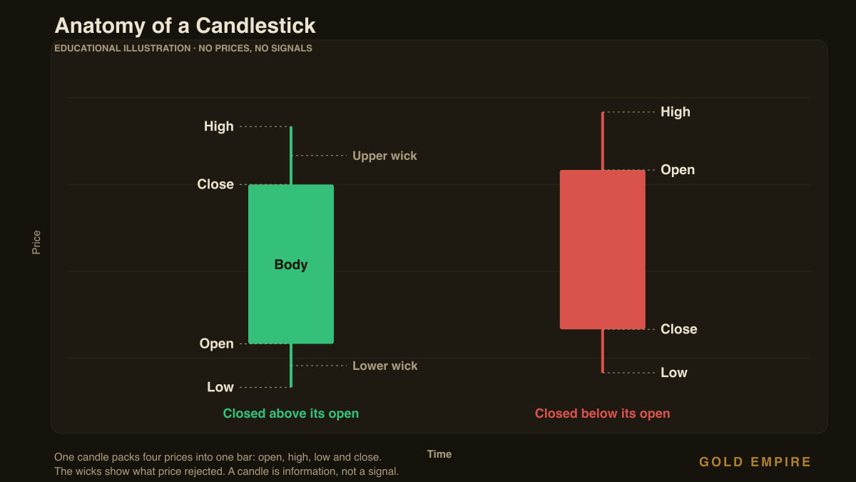
Inside that slice, the candle records four prices:
- Open, the price when the slice of time began.
- High, the highest price reached during that slice.
- Low, the lowest price reached during that slice.
- Close, the price when the slice of time ended.
That is the whole invention. Someone worked out that if you draw those four numbers as a shape instead of listing them as figures, your eye can absorb hours of trading in a fraction of a second. It is a compression tool for your attention.
The body and the wicks
The candle has two visible parts, and they answer two different questions.
The body is the thick rectangle. It stretches between the open and the close. It answers: where did this period start, and where did it end up? That is the settled part of the story, the price both sides eventually agreed on by the time the clock ran out.
The wicks, sometimes called shadows, are the thin lines poking out above and below the body. They stretch to the high and the low. They answer a different question: how far did price travel before coming back? A wick is territory that was visited and then rejected.
That distinction matters more than most beginners realise. Two candles can close at exactly the same price after starting at exactly the same price, so their bodies look identical, while one has enormous wicks and the other has almost none. Those are not the same hour of trading. One was a violent argument that ended in a draw. The other was a quiet drift. The body alone would never tell you.
Colour only tells you direction, not strength
On most platforms, a candle is coloured green when the close is above the open, and red when the close is below the open. Some charts use white and black, or hollow and filled. The colours are a convention, not information in themselves.
Here is the trap. Green does not mean good, and red does not mean bad. Green means one thing only: this period ended higher than it began. That is it.
A green candle can appear in the middle of a long slide downward. A red candle can appear in the middle of a strong climb. Reading a single colour as a verdict on the market is like judging a football match by watching ten seconds of it. You have information, but almost none of the context that gives it meaning.
What the shape can honestly suggest
Once you separate body from wicks, some candles start to carry a readable character. Not a prediction, a character.
A long body with small wicks suggests one side controlled that entire period. Price opened, moved in one direction and stayed there until the close. There was little argument.
A small body with long wicks on both sides suggests the opposite. Price ran up, ran down, and finished roughly where it started. Both sides pushed, neither won. It is indecision drawn as a picture.
A small body with one very long wick suggests price tried to go somewhere and was pushed back. Where the wick points is where the attempt failed.
Notice the word doing the work in each of those sentences: suggests. This is the honest limit of candle reading, and it is where the gap between beginners and experienced traders shows up most clearly.
The mistake almost every beginner makes
The mistake is treating a candle shape as an instruction.
It happens like this. Someone learns that a small body with a long lower wick often appears where price stops falling. They now see that shape on the chart, feel a jolt of recognition, and act on it immediately. Then it fails, and they conclude candles do not work.
Candles worked fine. The reasoning was broken. Here is what went missing.
Location was ignored. The same candle shape means completely different things depending on where it appears. A rejection wick sitting at a level price has respected several times before is a meaningful event. The identical shape floating in the middle of nowhere is close to random. The shape is the smaller half of the information. Where it happens is the larger half.
Timeframe was ignored. A dramatic candle on a 1-minute chart may be one unremarkable wick on the 1-hour chart. Zoom out and it disappears entirely. If a signal only exists at one level of zoom, it was never much of a signal.
The candle was not finished. This one costs people real money. A candle only becomes final at its close. Until then it is still moving, and it can change shape completely in its last minutes. That beautiful rejection wick you are staring at can become a solid body going the other way before the hour is up. Acting on an unfinished candle is acting on a rumour.
The candle tells you what happened. It does not tell you what happens next. Anyone who tells you otherwise is selling something.
How to actually practise reading candles
Reading candles is a skill built by repetition, not by memorising a list of names. A simple routine that works:
Start on higher timeframes. Use the 4-hour or the daily chart. Fewer candles, each one carrying more meaning, and far less noise to confuse you. Beginners who start on 1-minute charts are trying to learn to read in a hurricane.
Describe candles out loud, in plain words. Point at one and say what it is: “opened here, pushed up, got rejected, closed near the bottom.” No jargon. If you cannot describe a candle in a sentence a non-trader would understand, you have not read it yet, you have only labelled it.
Always ask where. Before you attach any meaning to a shape, ask what it is sitting on. Is it at a level that mattered before? At the edge of a range? In empty space? A candle without a location is a sentence without context.
Wait for the close, every time. Make it a rule rather than a preference. It costs you nothing but patience, and it removes an entire category of avoidable mistake.
Look at what came before. One candle is a word. Three or four in sequence is a sentence. The story is in the sequence, not the single unit.
Why this matters for how you manage risk
There is a practical link between candle reading and survival that rarely gets mentioned.
Gold moves quickly, and its candles can be large. A trader who does not look at candle size before committing tends to size positions by habit rather than by what the market is actually doing that day. When conditions get wild and candles get long, that habit becomes expensive fast.
Reading candles properly is partly a warning system. Long, violent candles with big wicks in both directions are the market telling you conditions are unstable. That is information about how careful to be, not an invitation to trade more. Quieter periods look different, and they call for different expectations.
This is why we treat chart reading and risk management as one subject rather than two. Understanding what you are looking at is what makes your risk decisions sensible instead of arbitrary.
Building your foundation properly? Our free Survival Sheet covers the risk rules that keep beginners in the game long enough to get good, and we discuss market conditions daily with our community over on Telegram. No hype, no promises, just the boring work that compounds.
Get the free Gold Empire survival sheet, a one-page guide to protecting your account through the kind of market this article describes. One email, no spam, unsubscribe anytime.
Frequently asked questions
Are candlesticks better than line charts?
They carry more information. A line chart usually plots only closing prices, which hides the high, the low and everything price tried and rejected within each period. Candles keep all four prices. For understanding how a period actually unfolded, candles show you far more.
Which timeframe should a beginner use?
Higher ones. The 4-hour and daily charts have fewer candles, less noise and more meaningful movement. Lower timeframes produce far more candles, most of which mean very little, and they demand quick decisions before you have built the judgement to make them.
Do I need to memorise candlestick patterns?
No, and memorising them early tends to hurt. Named patterns are just common shapes, and their names give people false confidence. Understanding what the body and wicks represent will serve you better than a list of memorised patterns, because it lets you read shapes nobody named.
Why do candles look different on different platforms?
Because platforms use different colour schemes, and because gold trades across a decentralised market where each broker’s feed can differ slightly. Small differences in open and close prices between platforms are normal. If two feeds disagree wildly, that is worth investigating.
Can a single candle tell me where price is going next?
No. A candle is a record of what already happened. It can describe conditions, show where price was rejected and suggest which side had control during that period. None of that is a forecast, and treating it as one is how beginners get into trouble.
What does it mean when a candle has no wicks at all?
It means price opened at one extreme of the period and closed at the other, moving in essentially one direction throughout without being pushed back. It indicates one-sided control during that period. It says nothing about whether that control continues.
About the author
Matthew runs the Gold Empire community, where the focus is unglamorous: understand what you are looking at, protect your capital, and let time do the rest. He has watched enough traders skip the basics in a rush to reach the interesting techniques to know exactly where that road ends. He would rather you spent a week genuinely learning to read a candle than a month collecting patterns you cannot apply.
Risk disclaimer
This article is educational content only and is not financial advice, investment advice, or a recommendation to trade. Trading gold and other leveraged instruments carries a high level of risk and can result in the loss of your entire capital. Nothing here is a prediction of future price movement, and no entry, stop or target discussed should be treated as a signal. Past market behaviour does not indicate future results. Consider your own circumstances and seek independent advice from a licensed professional before trading.
One step first
Where should we send the Gold Survival Sheet?
Leave your email and we will send the free one page checklist, then take you straight to the Telegram channel.
No cost and no obligation. Educational only, not financial advice, and nothing here promises a return. Unsubscribe any time in one click.
Leave a Reply