
Somebody sends me a screenshot most weeks with a note that says bearish divergence in gold trading, price is making a higher high while the oscillator is making a lower one, so the top is in. The pattern in the screenshot is usually real. The conclusion drawn from it usually is not. I went and measured every one of these I could find in fifty eight years of gold data, and the honest answer is more interesting than either the people selling the pattern or the people mocking it would like.
Everything below is arithmetic I ran myself on the London afternoon gold auction record, with the assumptions written out so you can disagree with them specifically. There are no gold price levels in this article and nothing here is a recommendation.
What bearish divergence in gold trading actually describes
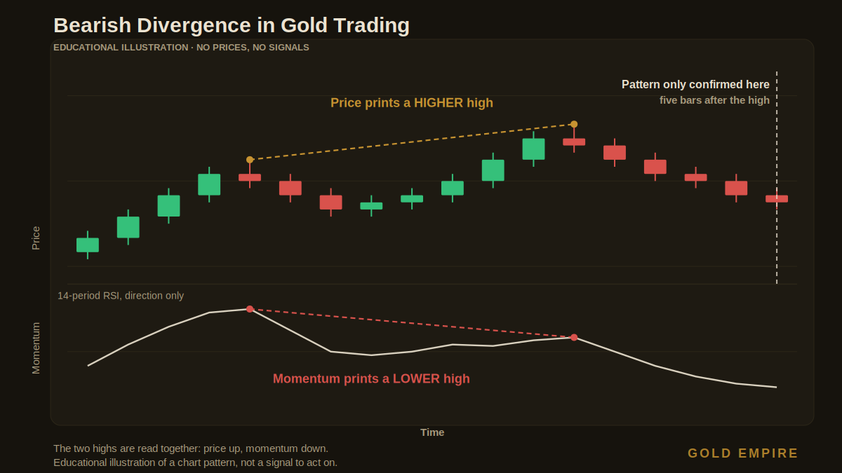
The pattern has two halves and they have to be read together. Price makes a high, pulls back, then makes a second high that is above the first. Momentum, usually measured with a fourteen period Relative Strength Index, makes a high at the same time as that first price high, then makes a second high that is below the first. Price up, momentum down, in the same stretch of chart.
The reasoning behind it is sound enough as reasoning. RSI measures the size of recent up moves against the size of recent down moves. If price grinds to a new high on smaller daily gains than it used before, the ratio falls even as the price rises. So the pattern is a description of something genuine: the market got to a higher number with less force behind it than last time.
The leap people make is from that description to a forecast. Less force now is taken to mean lower prices soon. That leap is the part I wanted to test, because it is the part that costs money.
How I measured it, and why the method matters more than the result
The price series is the LBMA Gold Price PM, the London afternoon auction print, published by the London Bullion Market Association. It runs from the first of April 1968 to the twenty ninth of September 2026, which is 14,693 trading days. One print per day, so this is an auction record rather than an intraday bar, and a high here means a high in the run of daily fixings.
I defined a swing high as a fixing that is the strict maximum of the eleven day window centred on it, five days either side. That produced 835 swing highs. Then a bearish divergence is a swing high whose price is above the previous swing high while its RSI is below the RSI at that previous swing high, with the two highs between five and sixty trading days apart, and with RSI at the later high at or above 55, which is the usual textbook precondition that the market be at least moderately stretched.
That gives 75 of them in fifty eight years. One every 196 trading days, about 1.29 a year. The first thing worth saying is that this is a rare pattern if you define it strictly, and most of what gets posted in group chats as a divergence would not survive the definition.
The trap that makes the pattern look far better than it is
Here is the part that changed my mind while I was writing the code, and it is the reason I am writing this article at all.
A swing high defined as the maximum of five days either side cannot be identified on the day it happens. By construction, you need the next five days to have printed lower before you can call it a high at all. So if you measure what price did starting from the high itself, the definition has already guaranteed you the first five days of the answer. That is not a finding. That is the test marking its own homework.
When I made that mistake deliberately and measured forward from the high, the pattern looked spectacular. Price was lower ten days later in 85.3 per cent of cases. If I had stopped there, this would be a very different and much more popular article.
Measured properly, from the confirmation day, which is the first day a human being could actually have known the pattern existed, price was lower ten days later in 52.0 per cent of cases. The gap between 85.3 and 52.0 is not a subtlety. It is the whole difference between a tradeable claim and a coin flip, and it is entirely an artefact of when you start the clock.
The size of what gets handed over for free in that window is measurable too. Between the high and the confirmation day, the median case had already fallen 1.92 per cent. A look ahead test gives you that move as a gift. The market does not.
What 75 bearish divergences in gold actually did
Comparing against all days would be a soft test, because a swing high is by definition a local top and local tops tend to be followed by weakness whether or not momentum diverged. So the fair comparison is against other swing highs that were also stretched, RSI at or above 55, and confirmed the same way, but showed no divergence. There are 474 of those.
Ten days after confirmation, price was lower in 52.0 per cent of divergence cases against 48.7 per cent of the control group. Twenty days, 54.7 against 46.8. Sixty days, 41.3 against 44.6, which is to say that at the longest horizon the divergences were followed by slightly fewer declines than the swing highs without them.
So the strongest reading the data supports is this: there is a small effect at twenty days, about eight percentage points over a comparable group, on a sample of 75. That is not nothing. It is also nowhere near enough to carry a decision on its own, and it inverts by sixty days.
Two more numbers finish the picture. In 46.7 per cent of cases the market printed a fixing above the divergence high within twenty days of confirmation, meaning the high the pattern was pointing at did not hold at all. And splitting by decade, the twenty day hit rate runs from 33.3 per cent in the 2020s to 80.0 per cent in the 2000s, on samples of nine to nineteen. A statistic that swings that far between decades on samples that small is not a stable property of the market. It is noise wearing a pattern’s clothing.
Why the pattern survives anyway
Patterns like this persist because of how they are remembered rather than how they perform. A divergence that preceded a fall is memorable, screenshot, and posted. A divergence that preceded a new high is quietly reclassified as a failed signal or as the wrong timeframe, and it does not get posted. Nobody is lying. The sample is just being assembled by memory, and memory is not a random sampler.
The look ahead problem makes it worse, because it is invisible from the inside. If you scroll back through a chart and mark the divergences, your eye finds them at the completed highs, where they are obvious. You are doing the 85.3 per cent version of the test without knowing you are doing it. The pattern feels reliable because you are seeing it under conditions you will never have in real time.
What I think it is honestly good for
I am not telling you to delete the indicator. I am telling you what its output supports.
A bearish divergence is a reasonable description of a market that is climbing with less force than it climbed before. Read as a description, it is accurate and sometimes useful context, in the same way that knowing where the crowd is positioned is context. Read as a forecast of the next twenty days, the evidence is an eight point edge over a comparable group, on 75 samples, that reverses at sixty days and swings between 33 and 80 per cent depending on which decade you happen to be trading in.
The practical consequence is about sizing rather than direction. Nothing in these numbers justifies a bigger position, an earlier entry or a conviction that a level will hold. If an observation moves your size, it needs to be far more reliable than this one is. That is the same test I would apply to market structure or to a liquidity sweep, and most chart observations fail it.
Get the free Gold Empire survival sheet, a one-page guide to protecting your account through the kind of market this article describes. One email, no spam, unsubscribe anytime.
Frequently asked questions
Does a bearish divergence mean gold is about to fall?
On this data, no, not reliably. Measured from the first day the pattern could be seen, price was lower twenty days later in 54.7 per cent of the 75 cases, against 46.8 per cent for comparable stretched highs without a divergence. That is a small edge on a small sample, and it disappears and reverses by sixty days.
Why is your hit rate lower than what other sites report?
Almost certainly because of when the clock starts. If forward returns are measured from the swing high itself, the same data gives 85.3 per cent at ten days rather than 52.0 per cent. A swing high defined with a five day window cannot be known until five days later, so measuring from the high builds the answer into the question.
Would a different RSI setting or timeframe change the result?
It would change the numbers, certainly. It would not change the structural problem, which is that any swing based definition carries a confirmation lag, and any test that ignores that lag will flatter the pattern. If you test a variant, test it from the confirmation bar and compare it against similar highs without divergence rather than against all days.
Is a divergence on a longer timeframe more reliable?
This test used daily auction prints, so I cannot answer for intraday charts from this data, and I would rather say so than guess. What I would point out is that a longer timeframe means a longer confirmation lag in calendar time, so the cost of the delay gets bigger, not smaller.
What about bullish divergence?
Same method, mirrored, and the same caution applies. I have not published those numbers because I have not run them with the same care, and I am not going to assert a result I have not measured.
Where Gold Empire fits
Gold Empire is free to follow. Daily gold analysis with the reasoning written out, the losing days included rather than quietly dropped, plus an optional Kit for people who want the method in one place. There is no promise of profit here, because nobody honest can make one.
If this article stopped you from sizing up on a divergence, it did its job. The habit it belongs to is the unglamorous one: decide what an observation is worth before you let it change your risk. That sits with risk management in gold trading and with reading a gold chart with a clear head, and if you want to know who is writing this, the about page covers it.
About the author
Matthew has spent a long time around gold, most of it learning things the slow way, and now writes them down so other people can learn them the fast way. He has a particular impatience with backtests that start the clock at a moment nobody could have traded, because those are the ones that turn a coin flip into a conviction. Nothing in this article is personal advice, and no entry, stop or target discussed should be treated as a signal.
This article is educational content about a chart pattern and about how to test one. It is not investment advice, not a recommendation of any indicator, technique or platform, and not a solicitation to trade. The price series used is the LBMA Gold Price PM published by the London Bullion Market Association, covering 14,693 trading days from April 1968 to September 2026. Every statistic here is my own arithmetic on that series under the definitions stated in the text, a fourteen period Wilder RSI, a five day swing window, an RSI threshold of 55 and a five to sixty day separation between highs; different definitions will give different numbers, which is rather the point. Past behaviour of a pattern is not a forecast of its future behaviour, and no gold price level appears anywhere in this article. Trading carries risk of loss.
One step first
Where should we send the Gold Survival Sheet?
Leave your email and we will send the free one page checklist, then take you straight to the Telegram channel.
No cost and no obligation. Educational only, not financial advice, and nothing here promises a return. Unsubscribe any time in one click.
Leave a Reply