
Every few weeks somebody asks me for the best chart settings for TradingView, and what they usually want is a list: these three indicators, these period numbers, this colour scheme, copy it and the chart will start telling the truth. I understand the appeal. I spent about eighteen months of my own trading life believing that the arrangement of things on my screen was a solvable problem, and that once I solved it the rest would follow. It did not follow. What actually happened is that I kept adding, because adding felt like progress and removing felt like giving something up.
So rather than hand over another list, I did something I should have done years earlier. I took the published daily gold benchmark for the last ten years and measured how much the popular indicators actually disagree with each other. Not how they look, not how they feel on a Tuesday afternoon, but how much independent information a second, third and sixth indicator adds once the first one is already on the chart. The answer turned out to be smaller than I expected, and it changed how my own screen looks.
What People Mean When They Ask for the Best Chart Settings for TradingView
The question is almost never really about settings. Underneath it there is usually one of three worries, and they are worth separating because they have different answers.
The first worry is am I missing something. Somebody saw a screenshot with six panes and assumed the person behind it was seeing more of the market than they were. The second is am I being fooled. A trader has been stopped out a few times in a row and suspects the chart itself is misleading them. The third is genuinely mechanical: what timeframe, what colours, what defaults, so the thing is readable at seven in the morning without squinting.
Only the third one is a settings question. The first two are questions about information, and information is measurable, which means we do not have to argue about it.
I Measured How Much Six Indicators Actually Disagree
The test
I used the London Bullion Market Association daily gold benchmark, the afternoon fix, from January 2016 to the end of December 2025. That is 2,506 published sessions. After allowing for the warm-up each indicator needs before it produces a value, 2,457 sessions had a reading from all six of the indicators I tested. The data is public and free, and I have linked it at the end so you can rerun this yourself rather than take my word for it.
The six were chosen because they are the ones that appear on most crowded charts, and because they are supposed to be measuring different things: RSI on 14, Stochastic %K on 14, CCI on 20, Bollinger %B on 20 with 2 standard deviations, the MACD histogram on 12, 26 and 9, and the plain percentage distance between price and its 50 period simple moving average.
Then I asked a boring question. Across those 2,457 sessions, how closely does each pair move together?
What came back
The median correlation across all fifteen pairs was 0.72. That alone is worth sitting with. Half the pairings of supposedly independent tools move together more than seventy percent of the way.
The extreme case was almost comic. CCI on 20 and Bollinger %B on 20 correlated at 0.997. Those two are not two indicators. They are the same measurement with different arithmetic on top and a different y axis, and if you have both on your chart you have drawn one line twice and given yourself the impression of confirmation.
The most independent pairing was the MACD histogram against the distance from the 50 period average, at 0.40, and even that is a long way from unrelated. RSI against the distance from the 50 period average came in at 0.90.
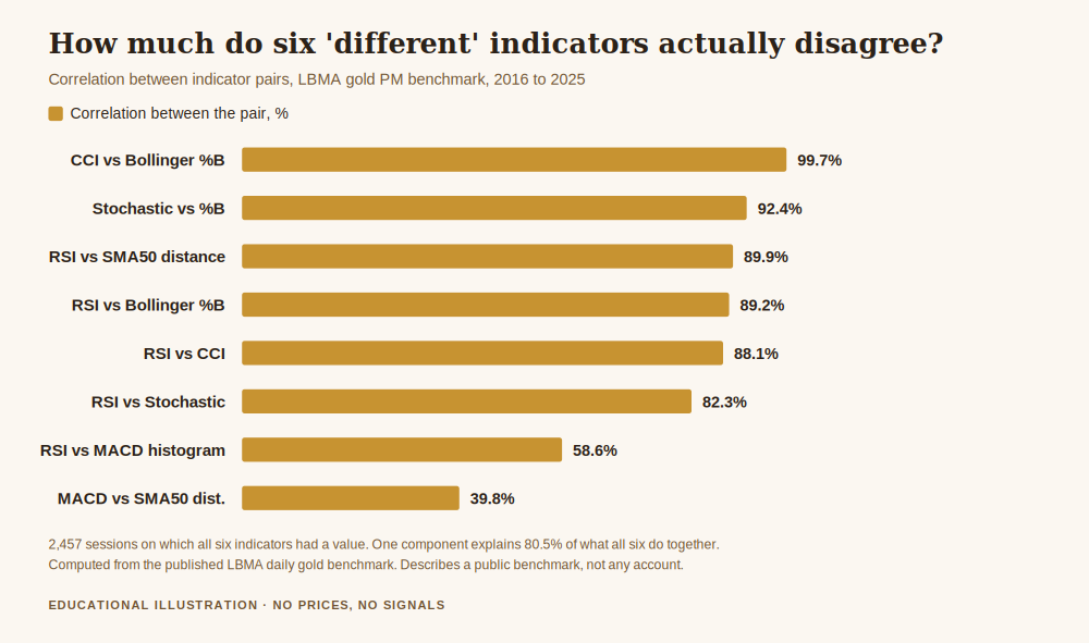
Then I ran the sharper version of the question. If you treat those six indicators as six sources of information and ask how many genuinely separate signals are hiding inside them, the answer is that a single underlying component explains 80.5 percent of everything the six of them do. Two components explain 91.8 percent. Six inputs, and by the second one you have accounted for more than nine tenths of the variation.
The practical translation is not that indicators are useless. It is that the fifth and sixth ones are decoration. You are paying screen space, attention and reaction time for something like eight percent of additional information, and you are paying it at the exact moment when attention is most expensive.
The Period Number Matters Less Than You Think
The other half of the settings question is the numbers. Should RSI be 14 or should it be 7, because somebody on YouTube said 14 is for beginners.
On the same ten years of gold data, RSI on 14 and RSI on 21 correlated at 0.98. RSI on 14 and RSI on 7 correlated at 0.94. The widest gap in the family, 7 against 21, was still 0.87.
That is what tuning a period number buys you. You are not switching to a different instrument, you are adjusting the smoothing on the same one, and at the margins where it does differ it differs by being faster and therefore noisier, or slower and therefore later. There is no setting that is both. Anyone offering you one is selling something.
I am not saying the number is arbitrary. I am saying that if you are changing it in the hope that a different number will change your results, the change you are looking for is not in there. I have watched traders spend a fortnight on this while the actual leak in their account, which was size, sat untouched. If that sounds familiar, risk management in gold trading is the piece I would read before touching a single chart setting.
What a Crowded Chart Actually Costs You
The cost is not that indicators lie. It is a mismatch of frequency, and it is easy to miss because it accumulates quietly.
Take one indicator at its default settings. Over those ten years, RSI on 14 crossed up through 70 sixty two times and down through 30 twenty six times. That is roughly nine alerts a year from a single tool, doing what it was designed to do, with nothing wrong with it.
Now count what the market actually offered. Over the same period, gold completed sixty one distinct five percent moves, which is about six and a third a year.
So one indicator, alone, at factory settings, produces about nine invitations a year against roughly six substantial moves. Add five more indicators, each with its own thresholds and crossings, and the invitation count multiplies while the number of real opportunities does not move at all. The chart has not become more informative. It has become more talkative, and the arithmetic of what that does to an account is covered in how to stop losing money day trading, because frequency is where most of it goes.
There is a second cost that is subtler. I checked how often all six indicators sat on the same side of their neutral line at the same time: 60.4 percent of sessions. Most of the time, then, your six confirmations are one confirmation wearing six hats. When they finally do disagree, which is the moment a second opinion would actually be worth having, you have trained yourself to read disagreement as noise, because for six sessions out of ten it has been.
So What Settings Do I Actually Use
Here is the honest answer, offered as description rather than prescription. My gold chart has price, one moving average for context, and the levels I drew myself. That is it. No oscillator panes. I add one temporarily when I have a specific question, and I remove it when I have the answer.
The reasoning is not aesthetic. It comes from the numbers above. If one component accounts for four fifths of what six indicators do, then one carefully chosen reference plus my own reading of structure gets me most of the available information with none of the false quorum. And the thing I most need protection from at seven in the morning is not a shortage of data. It is the feeling of confirmation, which is manufactured very cheaply by putting two versions of the same measurement side by side.
For the mechanical part of the question, the part that genuinely is about settings, my only real opinions are these. Pick a timeframe you can actually watch given your job and your sleep, and stop switching. Turn on the session separators if you trade gold, because gold does behave differently by session and it helps to see the boundary. Make sure the instrument you are charting is the one your broker actually fills you on. And set the chart so the numbers are large enough that you are not leaning in, because leaning in is a physical tell that you are about to overtrade.
What This Does Not Mean
It does not mean indicators are worthless. A tool that compresses a hundred candles into one readable line is doing real work, and there is nothing wrong with using one, or two, if you know what each is for.
It also does not mean my six were the right six, or that a correlation measured on the daily benchmark carries over unchanged to a five minute chart. It will not, exactly. Shorter timeframes are noisier and the numbers will shift. What almost certainly does carry over is the direction of the finding, because the underlying reason is structural: nearly every one of these tools is a transformation of the same recent price history, so they are related by construction, not by coincidence.
And it does not mean that having a clean chart makes you profitable. It removes one specific way of fooling yourself. That is all it does, and it is still worth doing.
Get the free Gold Empire survival sheet, a one-page guide to protecting your account through the kind of market this article describes. One email, no spam, unsubscribe anytime.
Frequently Asked Questions
What are the best chart settings for TradingView for gold specifically?
The gold specific parts are the session separators, because gold’s behaviour differs meaningfully between the Asian, London and New York sessions, and making sure your chart symbol matches the instrument your broker actually fills. Beyond that, the measurements above suggest the number of indicators matters far more than which ones you pick, and fewer is the cheaper error.
Is RSI 14 or RSI 7 better?
On ten years of daily gold data they correlate at 0.94, so the choice is between slightly faster and noisier, or slightly slower and later. Neither is better in general. If you cannot articulate why you want the faster one, the default is fine.
How many indicators should I have on one chart?
I cannot give you a number that fits everyone, but I can give you a test. For each indicator on your chart, say out loud what question it answers that nothing else on the chart answers. If two of them get the same sentence, one of them is redundant, and the measurements above suggest that will happen more often than you expect.
Does a cleaner chart improve results?
Not by itself, and I would be careful with anyone who claims otherwise. What it does is remove the illusion of independent confirmation, which is one specific and common way traders talk themselves into a position they had already decided to take.
Do these numbers apply to other markets?
The exact figures are gold’s. The mechanism is not gold specific: these indicators are mathematical transformations of the same price series, so high correlation between them is structural. I would expect the same pattern elsewhere with different decimals, but I have not measured it, so treat that as an expectation rather than a finding.
Where Gold Empire Fits
Gold Empire is a free Telegram channel where I post gold analysis with the reasoning stated before the move rather than after it, losing days included. Nothing needs to be bought to follow along, and there is an optional Kit later if you want more structure. I publish no profit claims and I do not rank brokers for payment.
The free survival sheet is the one page version of the discipline described here. If you want the neighbouring pieces, how to read a gold chart with a clear head covers what to do with the space you free up, and what is a moving average in gold trading explains the one line I did keep.
About the author. Matthew writes Gold Empire. He is interested in the unglamorous half of this business, cost, size, frequency and the arithmetic of staying solvent, on the view that most accounts are lost to ordinary errors repeated patiently rather than to any single dramatic trade.
Disclaimer: This article is general educational content about how chart indicators relate to one another. It is not financial advice, not a recommendation of any platform, indicator, setting or method, and not a suggestion to open any particular position. Trading gold and leveraged products carries a high risk of losing money rapidly. No entry, stop or target discussed should be treated as a signal. Every correlation, variance and frequency figure above was computed by me from the published LBMA daily gold benchmark over 2016 to 2025, using the afternoon fix, standard indicator formulas and 2,457 sessions on which all six indicators had a value. Those figures describe the behaviour of a public benchmark, not the behaviour of any account, any broker feed or any intraday timeframe, and past behaviour of a benchmark is not a prediction. No gold price is quoted anywhere in this article and no trading results are represented. TradingView is named because it is the platform readers ask about; this article is not affiliated with, endorsed by or sponsored by it.
One step first
Where should we send the Gold Survival Sheet?
Leave your email and we will send the free one page checklist, then take you straight to the Telegram channel.
No cost and no obligation. Educational only, not financial advice, and nothing here promises a return. Unsubscribe any time in one click.
Leave a Reply